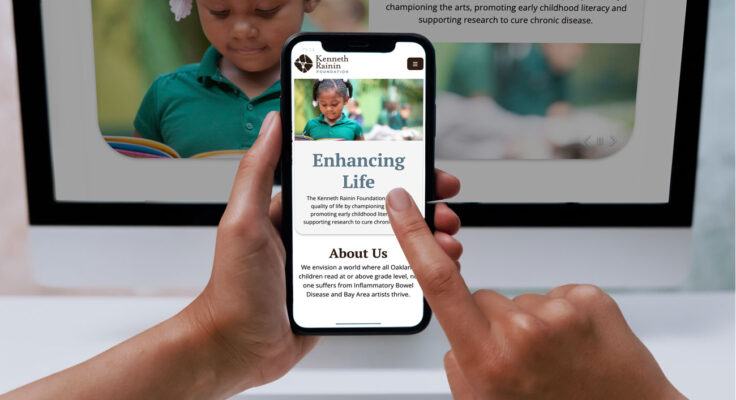
We are excited to welcome you to the Kenneth Rainin Foundation’s new website! For the past few months, our Communications Team and our Foundation colleagues have been hard at work to bring you an online resource that clearly expresses who we are, reflects our mission and values, and documents the progress we’re making in our work. We hope you’ll find this website accessible, engaging, and more importantly, helpful to you.
New Website Features
When we set out to work on our new website, we looked to our site visitor analytics—what pages are accessed most and other website patterns. We also looked at performance indicators, such as bounce rate and site load times. With that data and feedback from interviews with grantees, peer funders and partners, we focused on intuitive navigation and creating a seamless user experience where visitors could efficiently find what they need.
What does this mean in practical terms? Our new website features navigation that more directly connects with user needs, such as:
- Offering grant information in one click (previously, it took three clicks to get to our grants page).
- Streamlining access to top pages such as applying for funding or jobs, accessing our grantee portal and joining our community by signing up for communications.
- Showcasing blogs and videos that tell the story of our impact.
- Introducing visitors to our evaluation and learning framework to share what we’re discovering and learning.
Making Accessibility A Priority
As the Foundation engaged more deeply with diversity, equity and inclusion principles, accessibility became a focus for us. One project objective was to create a website that was accessible to more visitors, including people who are blind, have low vision, are hard of hearing or have motor impairments that affect their ability to use a mouse. We partnered with Perkins Access, the consulting arm of the world-renowned Perkins School for the Blind, to provide accessibility expertise throughout the entire project. They also paid people with disabilities to test the site upon completion to ensure authentic accessibility before launch. With their guidance and the partnership of our web developer, our new site is beautifully designed and meets Level AA Web Content Accessibility Guidelines.
“As the Foundation engaged more deeply with diversity, equity and inclusion principles, accessibility became a focus for us.”
Areas where we have improved accessibility on our website include:
- Applying adequate color contrast to ensure readability for people with low vision.
- Hiding decorative images and adding alt text to images that convey information so people who use screen readers can access important visual content.
- Underlining links in body text and hyperlinking on descriptive, unique text for easy navigation.
- Ensuring people with mobility impairments can use their keyboard to tab through the site efficiently
Look for our upcoming blog co-authored with our partners that will share insights from this collaboration.
We Are Still Listening
We also took into account the feedback from website visitors who said they were unaware of the breadth of the Foundation’s work across Arts, Education and Health. Our new site elevates the Foundation’s whole story in the navigation and content to give audiences a better sense of the Foundation as it is today as well as where we’re headed in the future. We hope it accomplishes what we set out to do.
As proud as we are of our new website, it’s still a work in progress. We have more plans for it—in the coming year, we’ll be working to improve the accessibility of our microsites and newsletters.
On behalf of the Communications Team—Teri Gardiner, Megan De Trane and me—we invite you to experience our new website and tell us what you think.
Thank You To Our Collaborators
Interdependence is a Rainin Foundation value and it captures the spirit of our work at the Rainin Foundation. We depend on our community of grantees and partners to help our projects succeed. We want to thank Perkins Access, our website developer Mission Minded, our grantees and partners who were interviewed, and our co-workers at the Foundation who helped us every step of the way.
I want to give special thanks to Megan De Trane for leading the website project and exceeding expectations, and to Teri Gardner for her expert attention to detail and valuable contributions.

