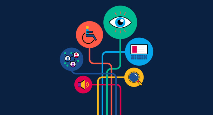
The Kenneth Rainin Foundation’s newly designed website marks an important milestone in our commitment to equity and access in our communications. For the past year, we’ve been working to create a website that would be accessible to more visitors, including people who are blind, have low vision, are hard of hearing or have motor impairments that affect their ability to use a mouse. Our web redesign team included our longtime consultant Mission Minded along with Perkins Access, the consulting arm of the world-renowned Perkins School for the Blind, who provided accessibility expertise throughout the entire project.
We invited a few members of the web redesign team to reflect on their collaboration and to share key takeaways from the process. Following are highlights from the conversation with Megan De Trane, Digital Communications Specialist at the Rainin Foundation; Geoff Freed, Director of Digital Accessibility Consulting at Perkins Access; as well as Mission Minded’s Rosie Powers, Strategist; and Adam Sypnier, Lead Web Developer.
Q: What were your goals for the website redesign?
Megan De Trane: The Rainin Foundation’s values encourage us to center equitable practices by honoring a diversity of perspectives and life experiences. We want to be intentional about how diversity, equity and inclusion show up in our communications. With this project, our main goal was to improve the user experience on our website. We aimed to do that through accessibility and intuitive navigation, along with faster site load times. Over a billion people worldwide have some type of disability and we don’t want to leave out any of our audience members.
Rosie Powers: On the strategy side, Mission Minded focused on elevating the larger story of an amazing Foundation rather than “siloing” that story by program area. We leaned into the brand look and feel to make that prominent in the navigation structure, and in the text and the design. We sought to change the user journey to introduce audiences to the Foundation’s mission as a whole before guiding them toward a specific grant program.
Adam Sypnier: On the developer side, I saw the potential for improvements that would enhance the website for everyone. We all saw the need to better serve both the organization and the user. My challenge was to give internal users flexibility with changes to text or background color but create code that maintains the proper contrast ratio. That enhances the website for anyone who’s not sight impaired. Everybody will benefit.
Geoff Freed: My goal is always to make sure that the client gets what they want, and for all users to have access. My job is to help think about accessibility at every stage of development. But my other role is to make sure that the whole team learns about accessibility—not just the importance of making this website accessible to people with disabilities, but how accessible design benefits everybody who comes to the Kenneth Rainin Foundation website now.
We want to be intentional about how diversity, equity and inclusion show up in our communications.
Megan De Trane, Digital Communications Specialist, Kenneth Rainin Foundation
Q: What were the benefits of your collaborative process?
Rosie: This is the first time that Mission Minded has worked with an accessibility consultant. It was a great learning process for us to collaborate with someone who has such deep expertise in this area. The feedback and workflow process with Geoff and his team was smooth and allowed us to iterate and learn along the way. By the time we were building the site we had this foundation of knowledge to work with, which saved time in the build and in the formal quality assurance testing process. And Megan did such a great job of managing and gathering feedback from her team at the Foundation. It was an inclusive process where everyone’s voices were heard but we didn’t lose time in the schedule.
Geoff: I love clients who follow a process and are committed to accessibility. In accessible design you start thinking about accessibility at the very beginning and it informs all of the design work. By the time you get to building the site, you’ve avoided the big problems and can focus on the details and nuance. Our final testing process didn’t uncover anything serious because we addressed everything in the workflow. That’s how it should always work. Everybody here worked hard to understand why we’re doing something for accessibility, as opposed to just doing the thing, and that lead to better outcomes. That’s the magic of the whole team being involved.
Megan: Because of our longstanding relationship with Mission Minded, they were already familiar with our work and had some ideas for improving the site. Their research process included bringing in our grantees and partners for paid user interviews, which informed the early design. Then bringing in Geoff’s expertise from the start and merging accessibility into the wireframing and through design and development, it was seamless.
It was a great learning process for us to collaborate with someone who has such deep expertise in this area.
Rosie Powers, Strategist, Mission Minded
Q: How did you approach reviewing and testing for accessibility?
Megan: I reviewed the final draft content to make sure we were hyperlinking descriptive, unique text and I organized headers correctly for easy navigation. I also wrote the alt text for images, which provides important access to visual content for people who use screen readers. Geoff helped us address accessibility strategies for charts that convey a lot of information. Rather than creating lengthy alt text, he recommended including a written description of the chart in the text on that page and using the alt text to indicate where users could find that description.
Geoff: It’s impossible to make something 100% accessible. That’s the whole point behind user testing. One of my colleagues who is blind relies on assistive technology every day. She will always find things that an expert cannot. And sure enough, she uncovered some things in this website that I wasn’t aware of. There are visual aspects to accessibility, such as color, layout and font choices. There are structural aspects as well, where we use tools to inspect the code or test implementations. I’ll use a variety of assistive technology tools like screen readers and magnifiers to test functions and watch how things work as I interact with the site.
Accessible design benefits everybody who comes to the Kenneth Rainin Foundation website now.
Geoff Freed, Director of Digital Accessibility Consulting, Perkins Access
Q: What tips do you have for others to begin improving accessibility?
Rosie: Prioritizing accessibility is the right thing to do because of how many folks will benefit from being able to engage with accessible websites. By including accessibility considerations early, it becomes baked into the process and you’re not going to forget the little things throughout the content creation process.
Geoff: Megan made a good point earlier about gathering input from grantees and partners—it’s always important to involve the audience in the design and the user testing process. You’ll get a different perspective.
Megan: And it’s okay to start small while you’re building your knowledge, capacity and budget to bring in experts like Geoff. We started a few years ago by writing alt text and images descriptions for images on our website and social media. Then with the website redesign, we were able to do much more, like updating some of our brand colors to meet color contrast standards. Improving accessibility is an ongoing process. Going forward, we’ll be adding audio description to our videos, and improving the accessibility of our microsites and newsletter.
Geoff: Everyone here has heard me say, “Fix the easy things first because it’s less effort for you and you ease your way into the accessibility process.” That’s not to say save all the most difficult things for last, but at least get started with easy stuff and then start prioritizing from there.
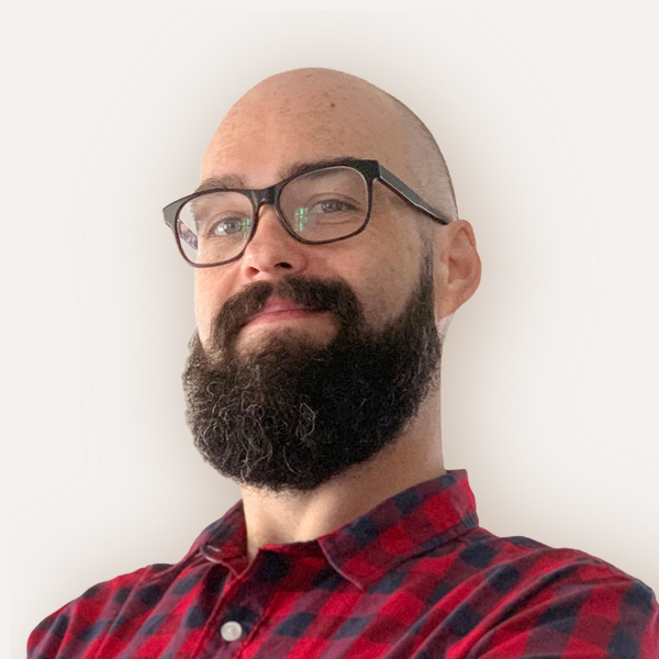
Adam: Start doing things in your regular practice of updating and maintaining or creating content. You don’t have to wait for a big redesign or rebranding to begin your accessibility work. Just start making that part of your practice. Then when you get to that stage of making bigger changes, it’s part of the process.
Megan: I want to acknowledge the importance of accessibility and setting aside the budget and time that it deserves. If you’re a funder, consider providing grant dollars for accessibility. Artist Laurel Lawson raised this great point in session two of our Let’s Talk series, which highlighted what artists with disabilities need to thrive. It’s important to learn from people who are already doing this work well. You can gain expertise, and, over time, everyone will benefit.
You don’t have to wait for a big redesign or rebranding to start your accessibility work. You can just start making that part of your practice.
Adam Sypnier, Lead Web Developer, Mission Minded
